
Role: Lead Designer (Solo Case Study).
Role: Lead Designer (Solo Case Study).
Timeline: 3 days.
Timeline: 3 days.

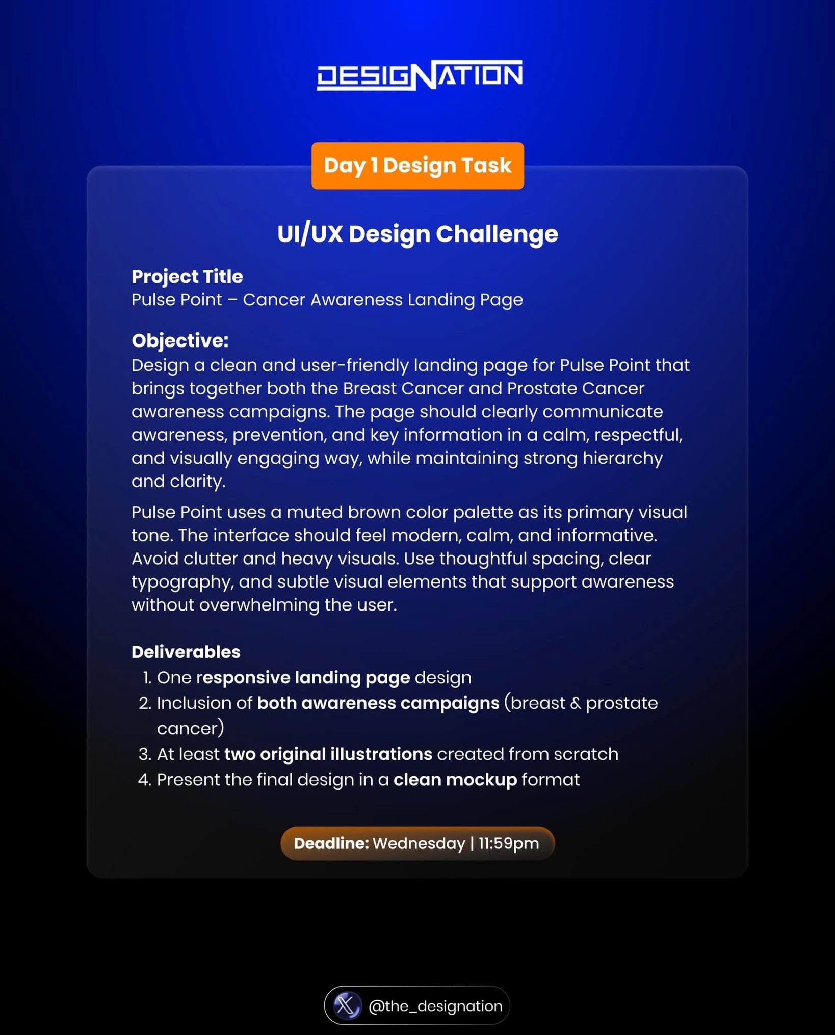
Problem Statement
Problem Statement
At least two original illustrations created from scratch.
At least two original illustrations created from scratch.
Solution
Solution
To bring originality and authenticity to the design, I created two custom illustrations featured in the hero section entirely from scratch. Using tools like the Pen Tool, Ellipse, and Bend Tool, I carefully crafted each element to ensure the visuals were unique, expressive, and aligned with the message of the project.
To bring originality and authenticity to the design, I created two custom illustrations featured in the hero section entirely from scratch. Using tools like the Pen Tool, Ellipse, and Bend Tool, I carefully crafted each element to ensure the visuals were unique, expressive, and aligned with the message of the project.

Project Process
Project Process
I began by clarifying my goals and fully understanding the project scope. I conducted thorough research to explore existing solutions, identify what’s already working, and analyze how to align those insights with my objectives. From there, I defined the core problem, explored all possible solutions, and mapped out a clear user journey through detailed user flows.
I began by clarifying my goals and fully understanding the project scope. I conducted thorough research to explore existing solutions, identify what’s already working, and analyze how to align those insights with my objectives. From there, I defined the core problem, explored all possible solutions, and mapped out a clear user journey through detailed user flows.
Typography: For this project, I chose clean and modern typefaces — Libre Baskerville and Figtree — to ensure readability and maintain a professional look. The typography enhances the user experience by making content easy to scan and understand, especially on mobile screens.
I used a mix of bold and regular font styles, with bold applied strategically to key elements like headings or CTAs to grab attention. In terms of font weight, I incorporated medium, semibold, and bold to create contrast, emphasize important information, and maintain visual consistency.
I also paid close attention to alignment and hierarchy, using left-aligned text for better readability and a clear structure that guides the user through the interface. The visual hierarchy — from headlines to body text — was carefully designed to help users navigate content effortlessly and intuitively.
Colour: To improve the visual experience, I adjusted the tone to something cooler, sleeker, and more refined. I also ensured the color meets accessibility standards for good contrast and readability.
Colour: To improve the visual experience, I adjusted the tone to something cooler, sleeker, and more refined. I also ensured the color meets accessibility standards for good contrast and readability.
Adaptability: The design is fully responsive, ensuring a consistent and seamless experience across all devices and screen sizes. This adaptability helps maintain usability and visual appeal whether users are on mobile phones, tablets, or desktops.
Adaptability: The design is fully responsive, ensuring a consistent and seamless experience across all devices and screen sizes. This adaptability helps maintain usability and visual appeal whether users are on mobile phones, tablets, or desktops.
Framer
Figma

GPT

Claude AI