
Project Overview
Project Overview
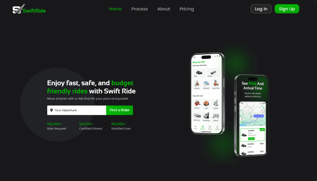
SwiftRide is a modern ride-hailing app designed with a sleek, intuitive interface. It focuses on seamless booking, real-time tracking, secure payments, and a smooth user experience across all devices — making transportation fast, reliable, and effortless.
SwiftRide is a modern ride-hailing app designed with a sleek, intuitive interface. It focuses on seamless booking, real-time tracking, secure payments, and a smooth user experience across all devices — making transportation fast, reliable, and effortless.
Goal: Create a ride-hailing experience with simplified navigation, allowing users to quickly understand the platform, view prices and estimated arrival times, and easily review ride details before booking
Goal: Create a ride-hailing experience with simplified navigation, allowing users to quickly understand the platform, view prices and estimated arrival times, and easily review ride details before booking
Role: Lead Designer (Solo Case Study).
Role: Lead Designer (Solo Case Study).
Timeline: 1 week.
Timeline: 1 week.


Problem Statement
Problem Statement
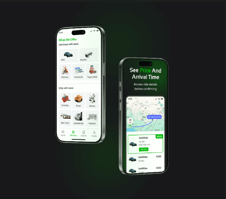
Users face difficulty comprehending the full scope of services provided, often resorting to assumptions due to a lack of clear and accessible information.
Users face difficulty comprehending the full scope of services provided, often resorting to assumptions due to a lack of clear and accessible information.
Solution
Solution
Provide a well-structured and visually clear service section with concise descriptions, relevant icons or illustrations, and intuitive navigation. This helps users quickly understand each service offered, reducing confusion and improving overall engagement.
Provide a well-structured and visually clear service section with concise descriptions, relevant icons or illustrations, and intuitive navigation. This helps users quickly understand each service offered, reducing confusion and improving overall engagement.


Project Process
Project Process
I began by clarifying my goals and fully understanding the project scope. I conducted thorough research to explore existing solutions, identify what’s already working, and analyze how to align those insights with my objectives. From there, I defined the core problem, explored all possible solutions, and mapped out a clear user journey through detailed user flows.
I began by clarifying my goals and fully understanding the project scope. I conducted thorough research to explore existing solutions, identify what’s already working, and analyze how to align those insights with my objectives. From there, I defined the core problem, explored all possible solutions, and mapped out a clear user journey through detailed user flows.
Typography: For this project, I chose clean and modern typefaces — Sansation and Poppins — to ensure readability and maintain a professional look. The typography enhances the user experience by making content easy to scan and understand, especially on mobile screens.
I used a mix of bold and regular font styles, with bold applied strategically to key elements like headings or CTAs to grab attention. In terms of font weight, I incorporated medium, semibold, and bold to create contrast, emphasize important information, and maintain visual consistency.
I also paid close attention to alignment and hierarchy, using left-aligned text for better readability and a clear structure that guides the user through the interface. The visual hierarchy — from headlines to body text — was carefully designed to help users navigate content effortlessly and intuitively.
Colour: I chose green as the primary color for Swift Ride because it conveys safety, growth, and movement — key values for a ride-hailing service. Green is also commonly associated with go/movement in traffic lights, which aligns well with the idea of fast, smooth rides. It creates a sense of trust and reliability while standing out visually in a competitive app space. This helps users feel confident when booking a ride.
Colour: I chose green as the primary color for Swift Ride because it conveys safety, growth, and movement — key values for a ride-hailing service. Green is also commonly associated with go/movement in traffic lights, which aligns well with the idea of fast, smooth rides. It creates a sense of trust and reliability while standing out visually in a competitive app space. This helps users feel confident when booking a ride.
Adaptability: After completing the initial design, I realized the green color I used was too bright and sharp, which could be distracting for users. To improve the visual experience, I adjusted the tone to something cooler, sleeker, and more refined. This new shade maintains the energy and freshness of green while offering a more balanced and modern look that aligns better with the overall design and enhances usability, especially in low-light or extended-use scenarios. I also ensured the color meets accessibility standards for good contrast and readability.
Additionally, the design is fully responsive, ensuring a consistent and seamless experience across all devices and screen sizes. This adaptability helps maintain usability and visual appeal whether users are on mobile phones, tablets, or desktops.
Framer
Figma

GPT

Claude AI